Following these brand guidelines will help Power to Change – Students be recognized consistently and professionally.
Read the guidelines, then download and use the documents and files below.
Thank you for helping us protect our brand and trademarks!
We want our brand to reflect the values P2C-Students lives by. They are foundational to our voice, visuals, and the stories we share.
contextualization
We meet students where they’re at culturally and spiritually. We reflect the unique campus contexts and speak in ways that resonate authentically with our students.
human dignity
Every person is made in the image of God. Our branding must honour the worth of every individual, reflect diversity, and avoid objectification or tokenism.
openness and adaptability
We foster a posture of curiosity and open dialogue. Our tone should be invitational, never preachy or closed off. We create space for honest exploration of faith and doubt.
In 2019, Power to Change Ministries redesigned its logo, using the abbreviation P2C.
The Marketing Department collaborated with P2C-Students Creative Communications team and other ministries to create a clear and adaptable logo, improving readability at smaller sizes compared to the previous design.
Key features
Focus on a cross shape without clichés
Versatile colour options for visibility on various backgrounds
A single-colour version for multi-faith use
The final logo is simple, robust, and effectively represents the organization's identity.
DO NOT change the colours to ones that clash or don’t complement
DO NOT change the proportions of the logo
DO NOT add shadow or any effects
Make sure there is enough contrast between the logo and the background colour.
Using the white transparent PNG
Using the coloured transparent PNG
Black/Dark Grey and White are the primary colours with an accent yellow. P2C Teal/Blue (#05C3DE) can still be used where necessary.
Text should be in either black on light backgrounds, or white for dark backgrounds for high contrast readability.
All colours should only be used as accent colours, with yellow being the primary accent colour. Green, pink and purple are secondary colours used at a minimum when necessary.
Each colour can also used at 80%, 60%, 40%, and 20% transparency.
Links can be coloured P2C blue: #05C3DE or dark blue: #007FA3
HEX CODE: #464646
RGB: 70 70 70
CMYK: 67 60 58 42
HEX CODE: #FFDC2E
RGB: 100 100 100
CMYK: 80 80 80 80
PANTONE: 115 C
HEX CODE: #FFDC2E
RGB: 100 100 100
CMYK: 80 80 80 80
PANTONE: 115 C
HEX CODE: #F05F92
RGB: 240 95 146
CMYK: 0 78 13 0
PANTONE: 190 C
HEX CODE: #855CA7
RGB: 133 92 167
CMYK: 54 74 0 0
PANTONE: 7661 C
⚠️ Green, pink and purple are secondary colours used at a minimum when necessary.
P2C Students’ main fonts are Montserrat (titles, headers, and body copy) and optionally, Fira Sans can be used for titles and headers (not for body copy).
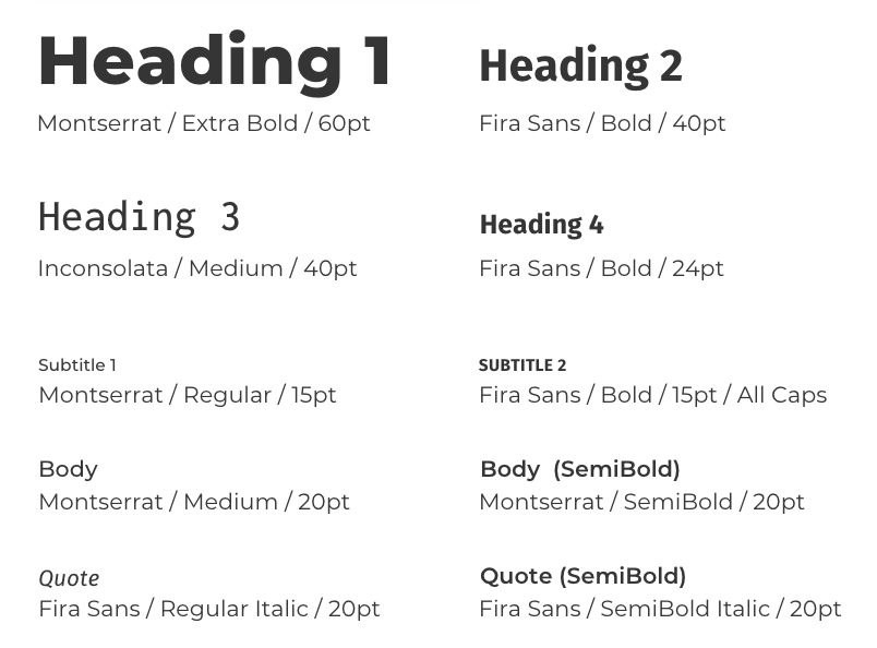
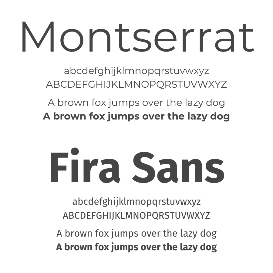
These fonts can be downloaded for free under the Open Font License (OFL) from Google Fonts.
If you are unable to use these fonts, use another sans serif font that resembles Montserrat or Fira Sans.
These are guidelines for how to use our fonts in headers, subtitles, body copy, and quotes. The sizes can be adjusted as needed.
Click here for a Google Doc template with these paragraph styles. Select from the menu bar: Format > Paragraph styles > Options > Set as my default styles, to save them for use.
Select “Use my default styles” when you open a new document to return to these styles.
We want our photos to reflect our communities and the students we serve.
When selecting images for your P2C materials, keep the following guidelines in mind to ensure we are representing our ministry in a way that is true to who we are and those we walk alongside.
Diverse: Reflect the ethnic and cultural diversity of our campuses and communities.
People First: Prioritize people over branding or objects.
Students in Community: Highlight connection, friendship, and life together. Sharing a meal, playing games, activities, group work, etc.
Students on Mission: Showcase students actively engaging in sharing their faith or serving others. Praying, in Bible study, life groups, volunteering, etc.
Candid and Authentic: Choose moments that feel natural and unstaged. Avoid overly polished or posed images; real is better than perfect.
Real Students over Stock: Use photos of actual students involved in P2C-S whenever possible. Link to Media Release
Current Generation: Select images that reflect today’s student culture and context while being mindful of our values. Blur or crop out prominent logos or brands.
If you have any questions about using the brand guide, please reach out to:
Deb Wong
Director of Creative Communications