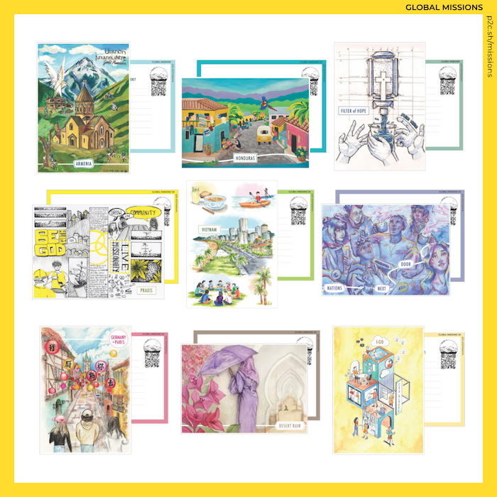
A collection of artists created nine drawings and paintings that reflect P2C-Students mission trips. Get to know them through their reflections on the creative process for each piece.
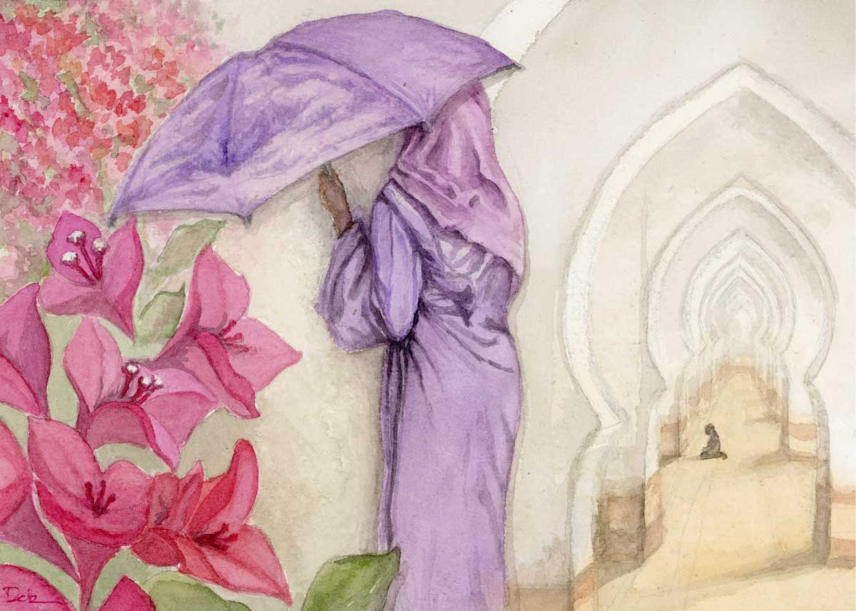
I watched as a man knelt in his place of worship. The filtered sun from the large entrance lit his back. Large arches stretched deep into the hall. It wasn’t the time for prayer, but he was there. I wondered about what he was seeking.
Vibrant blooms of orange, pink, and purple spilled over fences and walls along the streets. These flowers are able to flourish in drought-like conditions because its roots reach deep into the soil for water.
A woman stood in the market on a rainy day. I stood across the alley from her. Her choices of lavender and pink stood out amongst the greyish browns that trickled down from the awnings above, forming puddles at our feet. I took her photograph. I didn’t know her story.
As a photographer, I often make photographs not knowing what meaning or purpose they might have in the future. Be present. Pay attention. Be curious. These three moments stood out from my collection of photographs as I was researching for this painting. A man praying. Flowers in full bloom. A woman in purple sheltering from the rain.
Together, these three snapshots echo the prayer of Isaiah: “I am doing a new thing; now it springs forth, do you not perceive it? I will make a way in the wilderness and rivers in the desert.” May God’s grace rain down and form rivers in the desert.
This is the prayer I held as I put my watercolours to paper, for God to pour out his life-giving Spirit, and may he renew all people and things to himself.
I chose this colour palette and the medium of watercolours to reflect the warmth and softness of the people marked by generosity and welcome. I recessed the praying scene so it would form as the backdrop, choosing to draw the woman with the umbrella and the flowers in full bloom forward, describing what God is doing, bringing life in places where people are seeking.
Isaiah 43:4–6
“Since you are precious and honored in my sight,
and because I love you…
Do not be afraid, for I am with you;
I will bring your children from the east
and gather you from the west.”
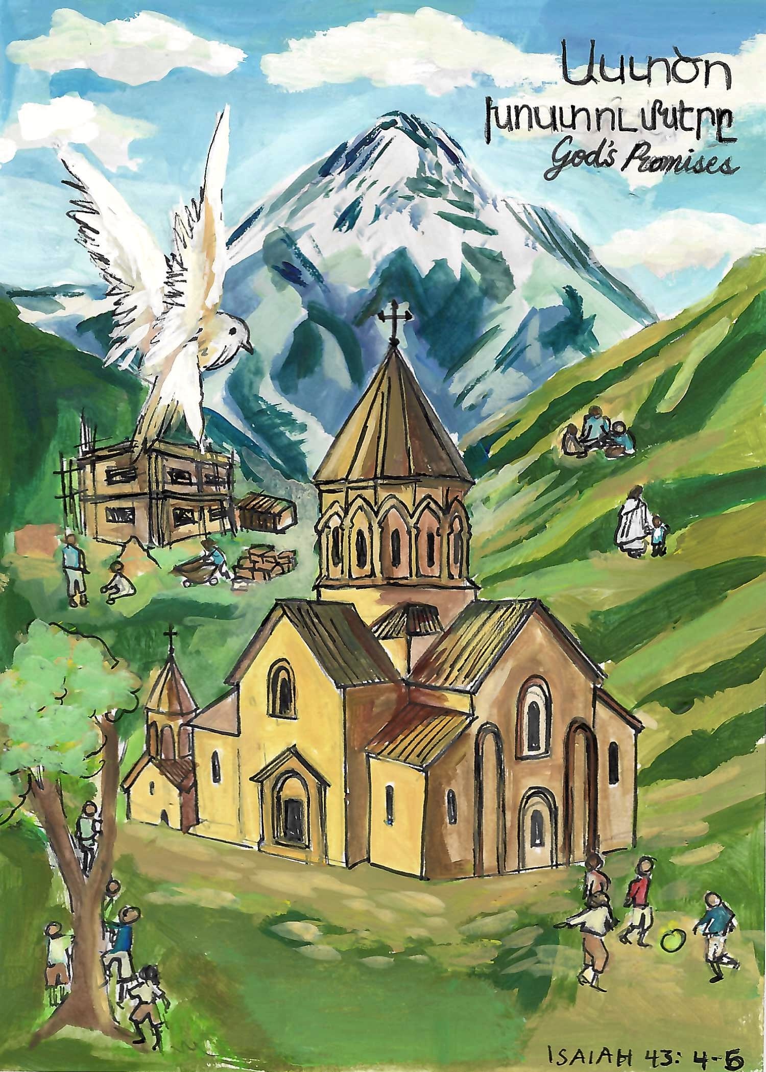
Armenia changed me.
Within the two weeks of construction, humanitarian aid work, and exploring the country, I experienced a richness that I couldn’t find back even in Canada.
I learned about the unfathomable suffering Armenians have gone through and the instability they still face today, all while experiencing the loving kindness and fire for God they embodied.
Through this, God revealed to me His heart for His children in Armenia: His heart for healing, restoration, and redemption. He showed me His ability to move mountains in their weakness and reminded me that He has not forgotten His people.
I experienced the pure joy of fully exerting yourself for someone else and the satisfaction that comes with seeing beyond yourself. Though we came from vastly different backgrounds, we were united in one Spirit, one heart, and one mission. God brought us there to be the hands and feet of Jesus and gave us His heart and burdened us with what burdens Him.
I came to realise that perhaps there is a greater purpose within hardship and suffering: it can create in us the greatest capacity to love, to give, and to overcome impossible challenges. Through suffering, God can bring forth a people who know how to love deeply, give freely, and trust Him beyond what they can see.
That, to me, is the power of God.
Isaiah 43 speaks of a God who calls His children precious, who is with them, and who gathers them from the ends of the earth. In Armenia, I caught a glimpse of that promise, not as something distant or abstract, but truly alive and active.
This work is a reflection of that promise: that God has not forgotten Armenia. That He is still gathering, healing, restoring, and redeeming. And that He invites us to participate in His work, to become His hands and feet, and to carry the burdens of His heart for His children.
Perhaps there is something greater to be treasured than worldly riches and fleeting self-importance, something that cannot be taken away.
For where your treasure is, there your heart will be also.
「我願為祢去」or「我愿为祢去」illustrated in this postcard translates to “God, I’m willing to go for you.” Going on a mission trip for the first time felt very daunting. I had many doubts prior to the trip: What if my Mandarin is bad? What if I don’t have the confidence to evangelize? Looking back, I realized these were Satan’s attacks and lies.
During the two weeks our team spent in Germany, we visited local universities to share God’s love with Chinese international students and our stories of how Jesus transformed our lives. Even though there were many fears and uncertainties in the beginning, God continued to remind us that missions is a partnership with the Holy Spirit and not based on our own strength. Everything we did as a team—campus evangelism, planning events, and personal conversations with the new students we met—was a testament to God’s power and sovereignty.
Jesus said, “Abide in me, and I in you. As the branch cannot bear fruit by itself, unless it abides in the vine, neither can you, unless you abide in me.” (John 15:4). Remembering that I am a vessel that God can always use, regardless of my weaknesses, is a big takeaway from this trip. The phrase「我願為祢去」is an encouragement to students to do God’s work and also allow him to work in you, whether on missions, in your current city, or abroad.

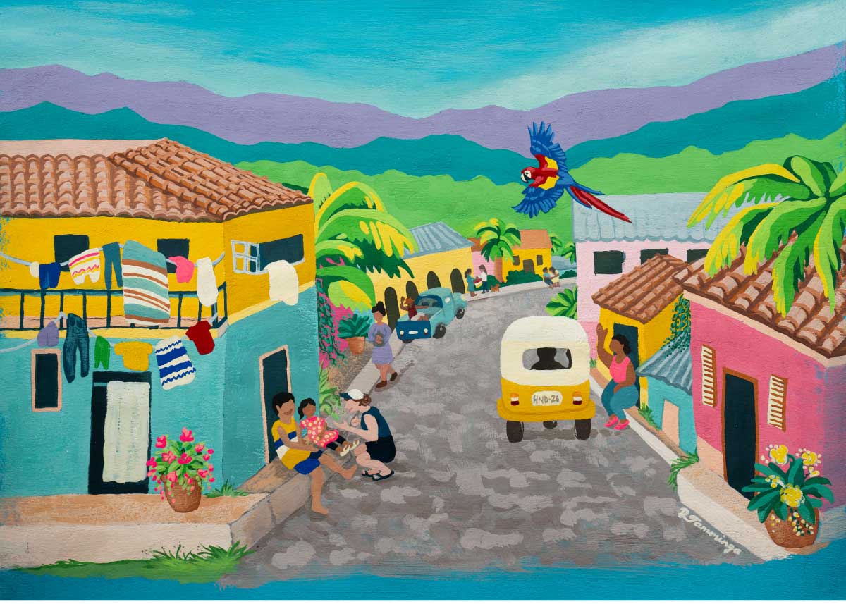
Honduras shouts to me of vibrance, warmth, and friendliness. I sought to draw out these qualities in my painting. I chose gouache as the painting medium because of its bold, bright colours and its ability to be both transparent and opaque. This helped to create the vibrant colours and atmosphere of the scene.
I love the warmth and friendliness of the Honduran people, and I referenced photos from last year’s Honduras mission trip to create realistic moments which would display this warmth, and welcome viewers into the scene.
I drew the initial sketch freehand on a digital drawing tablet and painted a teal base coat on my art paper. I printed the background layer of my sketch to scale and traced it onto my teal base using carbon paper so I could paint the background elements. Then I repeated the tracing process with the detailed elements, tracing and then painting the people, vehicles, laundry, trees, plants, and macaw.
Some significant elements in the painting are the scarlet macaw (Honduras’ national bird), the dark blue and white blanket (Honduras’ flag colours and cultural dress style), and the license plate on the mototaxi (“HND-26”, meaning “Honduras, 2026”). The woman speaking with the children on the apartment step was referenced from an actual photo from the 2025 Honduras mission trip. This scene highlights that ministry to children is a significant part of the trip.
I defined shapes with colour and shading rather than outlines to create natural three dimensional space. This style, especially with bright and vibrant colours, is common in artwork from Latin America, and I wanted to try it for myself. It’s a very different art style than I typically work in, and it was my first full painting using gouache, so this project was a satisfying challenge.
The final image is bold, warm, and vibrant, and I find it inviting and welcoming. The friendly people make me smile, and I wish I could step right into the scene. Creating this artwork for the Honduras mission trip was fun and stretching for me, and I’m so grateful I could use my art to invite others to share the love of Christ in Honduras.
The isometric concept of this postcard seeks to highlight the multi-faceted nature of this mission trip, integrating a breadth of operational skills and giftings into a cohesive image.
In the process of designing this image, I decided it was crucial to feature people in action, collaborating and working together on various projects. Rather than creating an image composed solely of symbols (such as mouse arrows, heart emojis, and other icons that harken to industries such as communications, social media, or technology), I wanted the image to portray individuals in action.
I kept the colour choices bright to emphasize the amount of creativity that is welcome and invited into the I-GO space—creativity in daily innovation, problem-solving, design, teamwork, and more. The cubic structure unifies multiple scenes of the different settings that participants of I-GO may find themselves in. It emphasizes both the diversity as well as the unity of all these skill sets in kingdom work.
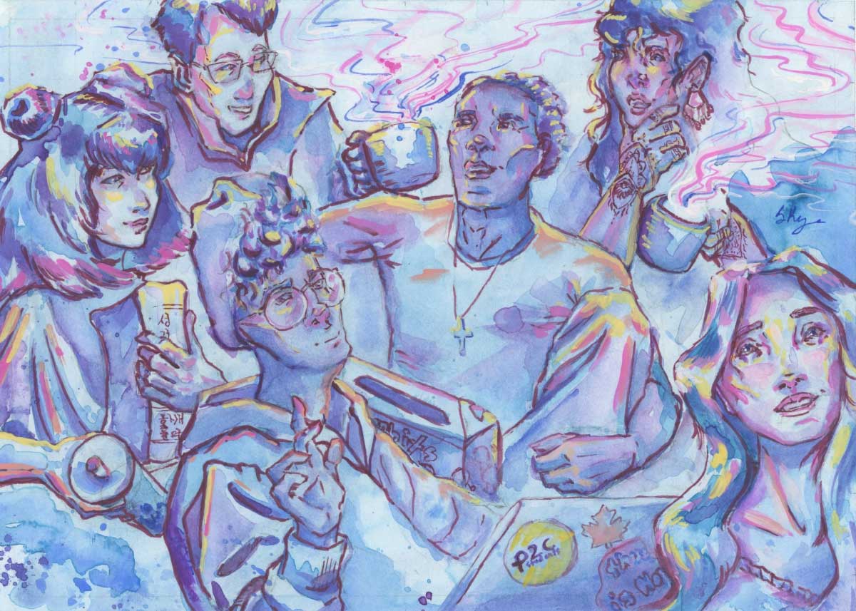
As a Canadian student who was a part of P2C, I really appreciated my international friends, and this painting was inspired by my favourite memories of us hanging out. This painting captures a moment of these memories: a group with a diverse set of experiences coming together to build a common community. A variety of food and drinks are present, while a few people talk theology, some do homework, and others chat—probably about fun upcoming P2C events!
I was thankful for friends who asked deep questions and helped me consider new perspectives. Especially when we hung out in a big group, it usually wasn't long before conversations turned theological. Everyone not only brought different questions—based on their experiences or cultural context—but also different ways of thinking to answer those questions.
I included only a minimal background because when we would hang out, it was the people that mattered, not the place. Tiny apartment living rooms smell pretty good when everyone is holding a steamy cup of chai! Food was an invitation to culture that I received from friends, and got to offer in return (recommending a flavour for someone’s first Tim’s donut is a lot of pressure!). My friends greatly encouraged my bubble tea habit, and so the painting had to include our favourite, colourful drink! I loved getting to include little cultural details, such as a Korean Bible. I am a long-time admirer of henna, and had to sneak that in, too!
I chose the medium of watercolours and gouache because I love how they allow me to create a cozy, relaxed atmosphere without sacrificing my ability to tighten up the details. I hope this painting inspires possibilities for the community that can be created when we take steps to get to know one another.
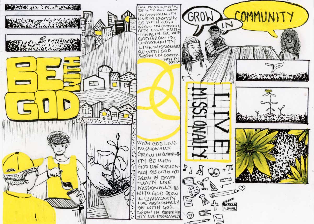
PRAXIS is the exploration of missional living—putting your faith into practice—in all of life. The invitation of the artwork is to see the renewal of that gospel anywhere and everywhere. PRAXIS is not tied to a particular location or type of work, so I wanted the piece to live in the liminal space of tangible actions and abstract concepts.
I drew on my own experience of participating in the PRAXIS 2024 trip to root the artwork in distinct visuals of the PRAXIS core values:
Be with God
Live missionally
Grow in community
Experiences such as serving people experiencing homelessness, planting a garden, and enjoying a conversation visually represent these values.
The challenge comes when considering how to create a visual piece that balances concrete and abstract. Especially in a small artwork like this, visuals have to carry weight without taking up much space. So how do you concretely—and simply—represent concepts of renewal, growth, rest, empathy, and missionality? To further the challenge, how does one concretely do this without misrepresenting the beautiful reality that PRAXIS is intrinsically liminal? I'm not sure this can be achieved, however there are some aspects to the piece that point toward balance.
The style of the artwork follows this desire to represent this space between concrete and abstract, the miraculous and mundane. The contrast of a bold yellow against the fine, black linework draws the eye towards the colourful spaces. Similarly, when we allow our eyes to be opened to the renewing work of the gospel, we can't help but see God at work around us.
Little vignettes distinguish the scenes of life from the abstract representations of growth and renewal. This isn't necessarily to separate these moments, but rather to show again the relationship of the two: as we live on mission, seeking to be with God and in community, we often have distinct moments of recognizing God. In this, too, is the differentiation in visual styles: curved organic shapes (humans, nature) intertwined with rigid, angular shapes (boxes, buildings, lines of text).
Finally, the artwork has a similar visual style to a comic book or graphic novel. My hope is that the piece would evoke these mediums to root the artwork in story. The telling and receiving of stories is something that I deeply value as an artist and a person. And as a PRAXIS participant, "story" was a medium that God used to draw me closer to others and himself. Just as with a comic or graphic novel, my intention is that this collection of images would point towards a greater story being authored together.
Asia Coast focuses on ministering to local university students and building meaningful relationships through daily life. The Beach was a new city for these teams, which meant pioneering connections, building trust, and stepping into unfamiliar spaces with faith and humility. The students partnered with local Christian student leaders and churches, invested in friendships, and created spaces where honest conversations about Jesus could unfold naturally.
I took inspiration from the photos and videos shared by the 2024 and 2025 team. I hoped to capture the vibrant sights and tastes of the Beach, from its pristine beaches and palm-lined streets to its family-run street food stalls, cafés, and bustling city life.
More importantly, I wanted to reflect the sense of togetherness and the shared experience of Jesus’ love that shaped this trip. One student shared that what stood out wasn’t just the scenery or food, but also the long conversations with local friends, the glimpses into their lives, and learning to love and serve their team well.
To hold all of this in a postcard, I chose a travel sketchbook style of ink linework and alcohol markers arranged as collage blocks rather than a single image. I selected scenes that showed the city’s unique offerings alongside the joys of living on mission together. Each sketch was drawn, copied, and coloured, then pieced together digitally with a soft background colour wash.
My hope is that you will sense the warmth of those friendships and the fullness of sharing life and faith across cultures. May it invite you to notice the simple but meaningful ways God works through shared meals, unhurried conversations, and laughter shared among believers.
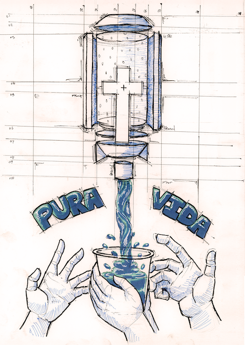
The construction-style drawing highlights the significance of the filters, an integral part of the Filter of Hope mission trip. It allowed me to fully show the filter and its purpose, both in how it relates to missions and as an allegory for the Christian faith. Having the annotated notes allowed me to fully show the basis for the water filter as well as the mission of Filter of Hope, showing it as a literal plan for what this mission trip is based on.
The cross is placed at the centre of the filter because it is not only the symbol at the centre of our faith, but also at the centre of the filter’s purpose. The meaning behind the cross is also a filter for us. Through God’s grace, Jesus’ death on the cross purifies us; it filters our sins and presents us clean before God. I wanted to include this meaning within the artwork as well.
I also wanted to include the phrase “Pura Vida” as I had heard from my friends who went on the Filter of Hope trip, and it really stood out to them. “Pura Vida” means “pure life”, and it was heard by my friends as a motto or mantra that the locals used. I felt it was very fitting with the message. Water is often seen as and associated with life. A filter purifies water, making it clean, safe and pure; Jesus cleans and purifies us, giving us a truly pure life.The cross is placed at the centre of the filter because it is not only the symbol at the centre of our faith, but also at the centre of the filter’s purpose. The meaning behind the cross is also a filter for us. Through God’s grace, Jesus’ death on the cross purifies us; it filters our sins and presents us clean before God. I wanted to include this meaning within the artwork as well.
I included the hands to keep a human element, because in the end that is the whole purpose: reaching and serving people. The central hands are clasped around the cup in a prayer-like pose, representing the water as an answered prayer. This shows people's need for clean water. The secondary meaning being the purification that Jesus Christ gives us is also something we need and an answered prayer. The other two hands are grasping towards the cup, showing that its contents are something that everyone needs and is something to be reached for and obtained.